Lessons from Visualization Research
How visualization is designed can significantly impact an end-user’s interpretation
Visualizations are tools used to communicate a story, are largely the output of a designer’s decision process—a series of choices to either add or omit information.
The study looks at how visualizations communicate; how the designer (intentionally or unintentionally) exerts control over the data and visualization; and how those decisions influence an end-user’s interpretation of the visualization.
The study highlights several areas to consider when designing and interpretation visualizations. Below are some key areas and a few examples:
- Data: including or omitting variables; removing outlier data; scaling or aggregating values.
- Visual representation: choosing what type of display to use (chart, graph, timeline, etc.) and how (color, typographic choices, etc.).
- Annotations: including or omitting data points in text format; including or omitting secondary contextual information; displaying source information; using irony or rhetorical questions.
- Interactivity: setting a default or initial view; allowing the user control to filter or navigate the information as they choose.
Source: Visualization Rhetoric: Framing Effects in Narrative Visualization, Jessica Hullman and Nicholas Diakopoulos. December 2011.
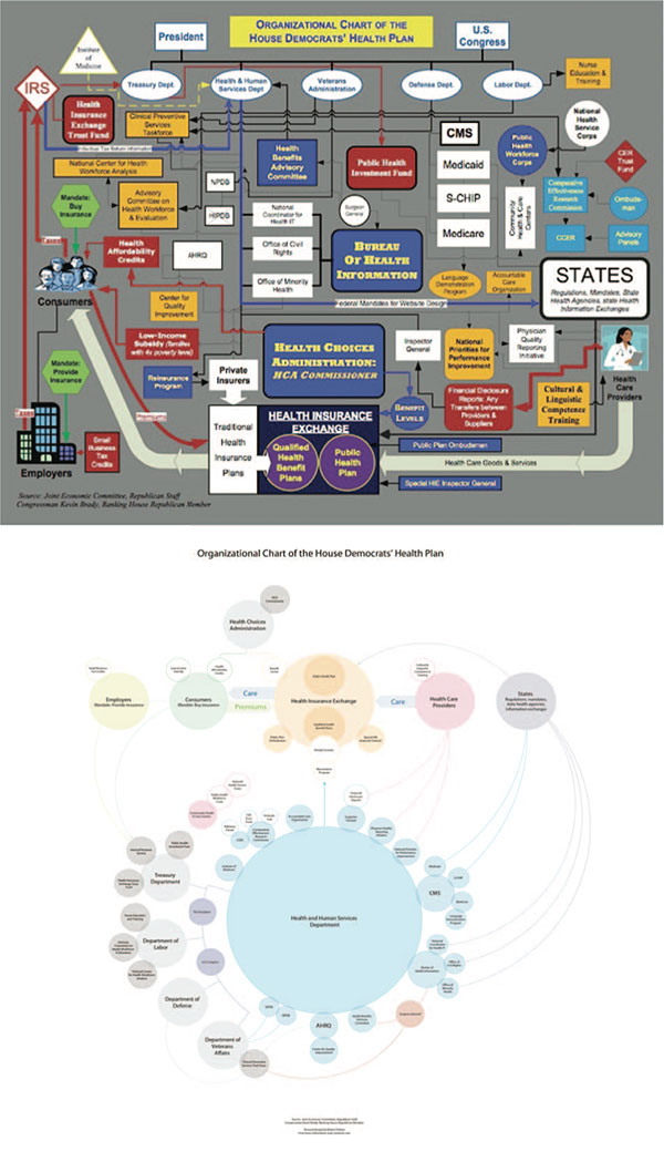
Chart released on Speaker of the House John Boehnerʼs website (top); chart in response to same sourceʼs ʻOrganizational Chart of the Democratʼs Health Planʼ by graphic designer Robert Palmer (bottom).