Bubble Chart

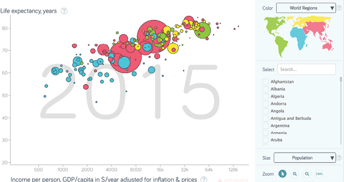
A bubble chart shows multiple variables, similar to a scatter plot. In addition to variables shown along the x and y-axis, dots on the scatter plot are replaced with "bubbles," the size of which represents a third variable. By using different colors to distinguish between categories, a fourth dimension can also be displayed.
In the example above taken from gapminder.org, the x-axis indicates income per person, the y-axis indicates life expectancy, the bubble size indicates population, and the color indicates different geographic regions. The chart would show if a relationship existed between the four variables.
Image source: Gapminder