Choropleth Map
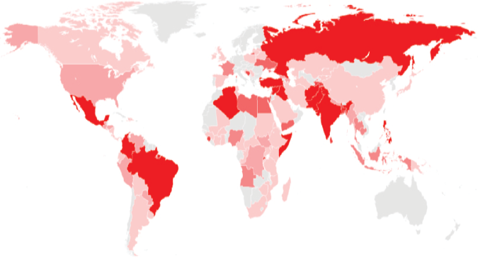
Choropleth maps illustrate how data changes over geographical regions. The variable is categorized into intervals, with each interval represented by a color, and the map filled accordingly. Color progression is used to represent the differences, often blending from dark to light or one color to another. Progression should be limited to few shades that are easily distinguishable by the human eye in order to make the map easy to read. Choropleth maps can provide a big picture overview of data variability by location.
Choropleth maps work best when geographic regions are fairly consistent in size. Otherwise, larger areas appear more emphasized, which could result in misinterpretation.