Stacked Bar Graph
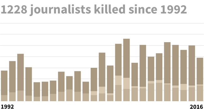
Stacked bar graphs are a variation of a bar chart where each bar is segmented into its sub-categories. Each bar is thus visualized as a sum of its components, with data values stacked on top of each other.
An example of a stacked bar chart would be to show the breakup of incidents by type, and how these change over time. This would provide key information regarding how the total changes, as well as how the individual categories change.
A variation of the stacked bar chart is a Marimekko chart, a type of stacked bar chart which shows the percentage split of each group so that all the segments add up to 100%.
Comparing segments may become difficult as they do not have a common baseline (comparing segments is easier in a 100% stacked bar chart, as the segments are proportionate to the whole.)
Image source: The Committee to Protect Journalists, John Emerson