Marimekko Chart
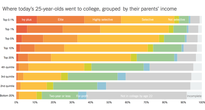
Marimekko charts are used to visualize categorical data and relationships between categories and their sub-categories. They operate similar to a 100% stacked chart, with data on both axes adding up to form a whole. Both axes are equal in length and are scaled to represent 100% with equally sized segments. The chart thus has segments of varying height and width due to the two-dimensional representation of data. The Marimekko chart is thus effectively used to display any data that can be summed up in a cross tabulation. An example of a Marimekko chart would be to show how implemented projects are split across region (x-axis) and across different types such as education, health, etc. (y-axis). The chart provides useful insights into distribution of data, relationships, patterns, and proportions.
Image source: The New York Times