Chord Diagram
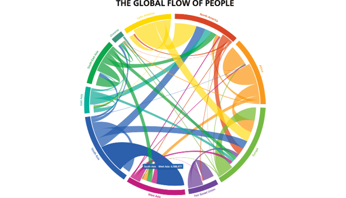
Chord diagrams visualize relationships between multiple entities. The chord diagram functions as a circle divided into categories, with "chords" connecting different categories based on the relationship being analyzed. For example, a chord diagram can be used to analyze migration patterns among countries. The arcs on the edge of the circle would represent each country, with the arc length representing proportional value. Chords would then be used to connect one country to the other, in order to show the proportion of people who have migrated to and from each country. The thickness of the chord on each side represents the proportion of people who have migrated from the given country. We would thus be able to analyze important flow patterns as a result. Different colors can be used to group the data into categories and make it simpler to read.
Image source: The Global Flow of People, Nikola Sander, Guy J. Abel & Ramon Bauer