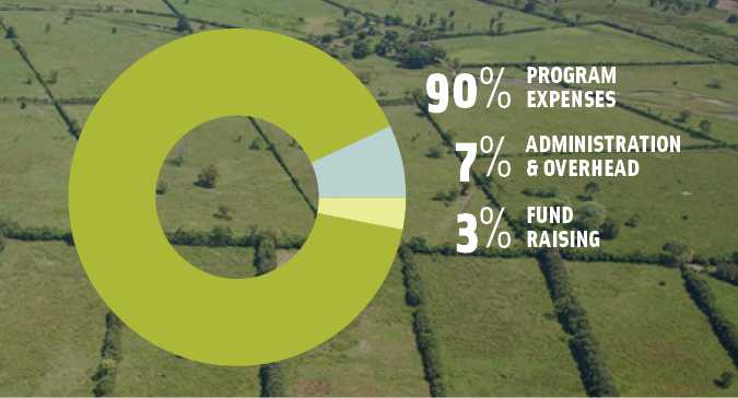
Donut Chart

The donut chart is a variation of a pie chart, with data split into categories based on proportionate value. A donut chart is thus essentially a pie chart with a hollow center. However, the length of the arc, as opposed to size of the slice, shows the relative value of each category in the donut chart. The hollow center helps deemphasize the use of area to show the proportion split of data, and allows more categories of data to be displayed effectively. The donut chart is also more effective if comparisons are to be made across charts. Donut charts can also use the center space for descriptive text if required.
As with pie charts, the circular form is aesthetically pleasing. However, donut charts can only show a small number of slices before becoming confusing. Comparison between multiple donut charts would be needed to show trends in data.
Image source: Fund for Global Human Rights