Density Plot

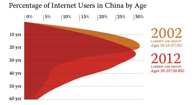
Density plots are useful for analyzing the distribution of data. Also known as a kernel density plot or density trace graph, the chart is a variation of a histogram. The chart displays the distribution of data over a continuous interval, smoothing out the noise in the data. This is done through "kernel smoothing," in order to create a smooth line function for the data. As compared to a histogram, which uses "bins" to define intervals, the density plot uses a continuous scale along the x-axis. It thus provides a more clear representation of the distribution shape. Peaks of the density plot help indicate where data is clustered, similar to the way a histogram is read. The y-axis of a density plot is scaled so that the area under the curve is equal to 1. It is thus particularly useful to show probability distributions.