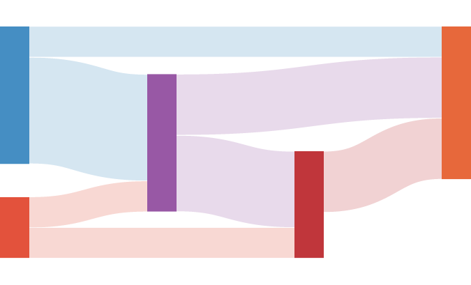
Sankey Diagram

Sankey diagrams are a specific form of flow diagram, showing the movement direction and flow quantity through arrows. The thickness of the arrows shows the proportional flow quantity relative to other arrows. Flow arrows can combine or separate their paths as they move along a process, and colors may be used to show different categories of movement, or to separate different stages in a process. The total inflow shown in a Sankey diagram should generally equal the total outflow. It is thus useful to visualize the transfer of energy, money, or materials. Such maps provide useful insights regarding the pattern of flow, where it is clustered, how much is being wasted, and so on.