Heat Map
Heat maps are a way of illustrating a range of values using intensity or shifting hues of color over an area.
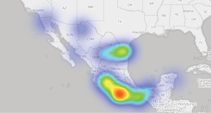
Heat maps are useful for displaying a range of intensities or clustering. Heat maps using a rainbow color scheme, for example, would use darker blue areas to indicate low concentration of data points through green, yellow, and orange to areas of bright red to indicate the highest concentration. Areas without color would indicate an absence of data.
Heat maps can be used over a geographic map or a matrix or grid or even superimposed over an image. Popular uses of heat maps include locating large numbers of clicks on a web page, and to illustrate where people look in eye tracking studies.
Image source: Journalists and media support worked killed during tenure of President Felipe Calderón Hinojosa. Data: The Committee to Protect Journalists, Graphic: John Emerson