Scatter Plot
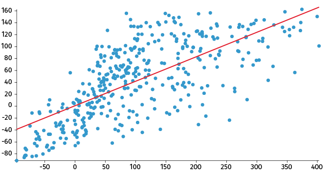
A scatter plot, or X-Y plot, shows the relationship between two variables, x and y. The two variables are displayed on two axes, with data points plotted on the grid. In this way, one can sometimes see clusters or trends within the data.
A regression line, sometimes called a "trend line" or "line of best fit" is drawn as close to the points as possible. This line helps determine if there is any correlation between the two variables, and if there is, whether it is positive or negative.