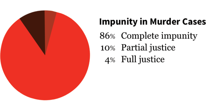
Pie Chart

Pie charts show how data is split into sub-categories. Pie charts use subdivisions of a circle to visualize proportions, with the whole circle being equal to the total and sum of its parts. The parts of the whole are represented by slices of the pie with the angle, area, and arc length of each wedge used to represent the sub-section. An example of how a pie chart is used is the split of units by category.
Pie charts represent the percentage split of the data as opposed to the numerical values, though numerical values can be appended in annotation.
Pie charts are a fairly common chart type and benefit from this familiarity. However, representing more than a few categories makes the chart difficult to read. Pie charts are not suited for showing trends, and it can be difficult to compare multiple pie charts.